Back to portfolio
Case study by Kartik Harish, UX design

A personal concept project for WhatsApp UPI

Who hasn’t paid yet?

Groups already talk about money in WhatsApp, then settle it in other apps, because paying faster was never the problem. Organisers still work out shares, match screenshots and chase people one by one. This concept brings that coordination into the chat.

Someone I spoke to had money outstanding for two months. Not because they didn’t know how to send a payment request, but because asking again felt awkward. Eventually, they stopped following up.
Type
Personal concept project. Not affiliated with WhatsApp or Meta.
My role
UX and product designer: research, concept and UI.
Platform
Android, 360px screens, designed in Figma.
Status
Concept. Not yet tested with users.

The solution in three screens

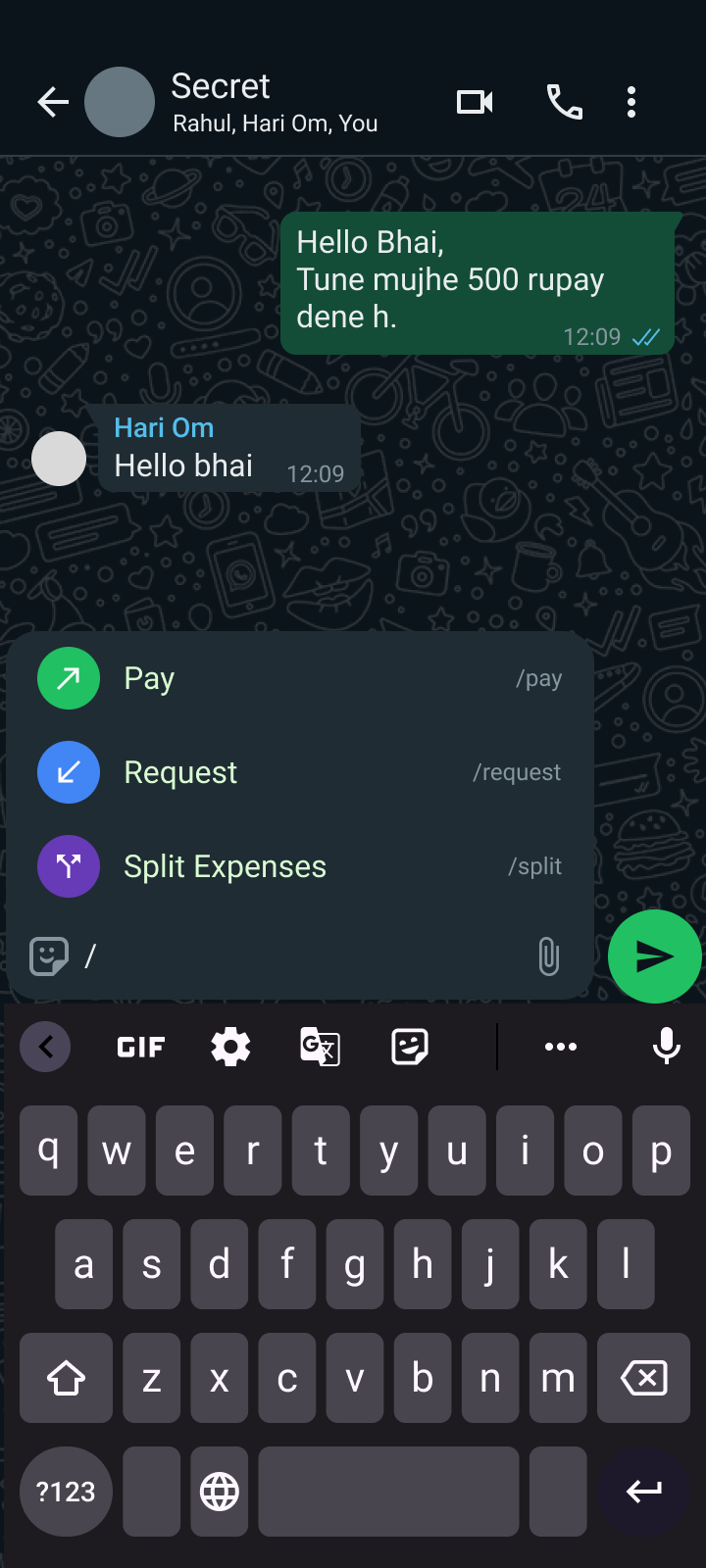
Chat with the slash menu open showing Pay, Request and Split Expenses
Type / and the action menu opens
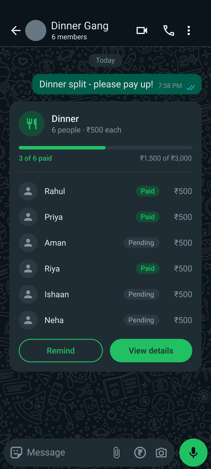
Group card showing who has paid and who is pending
One card shows who has paid
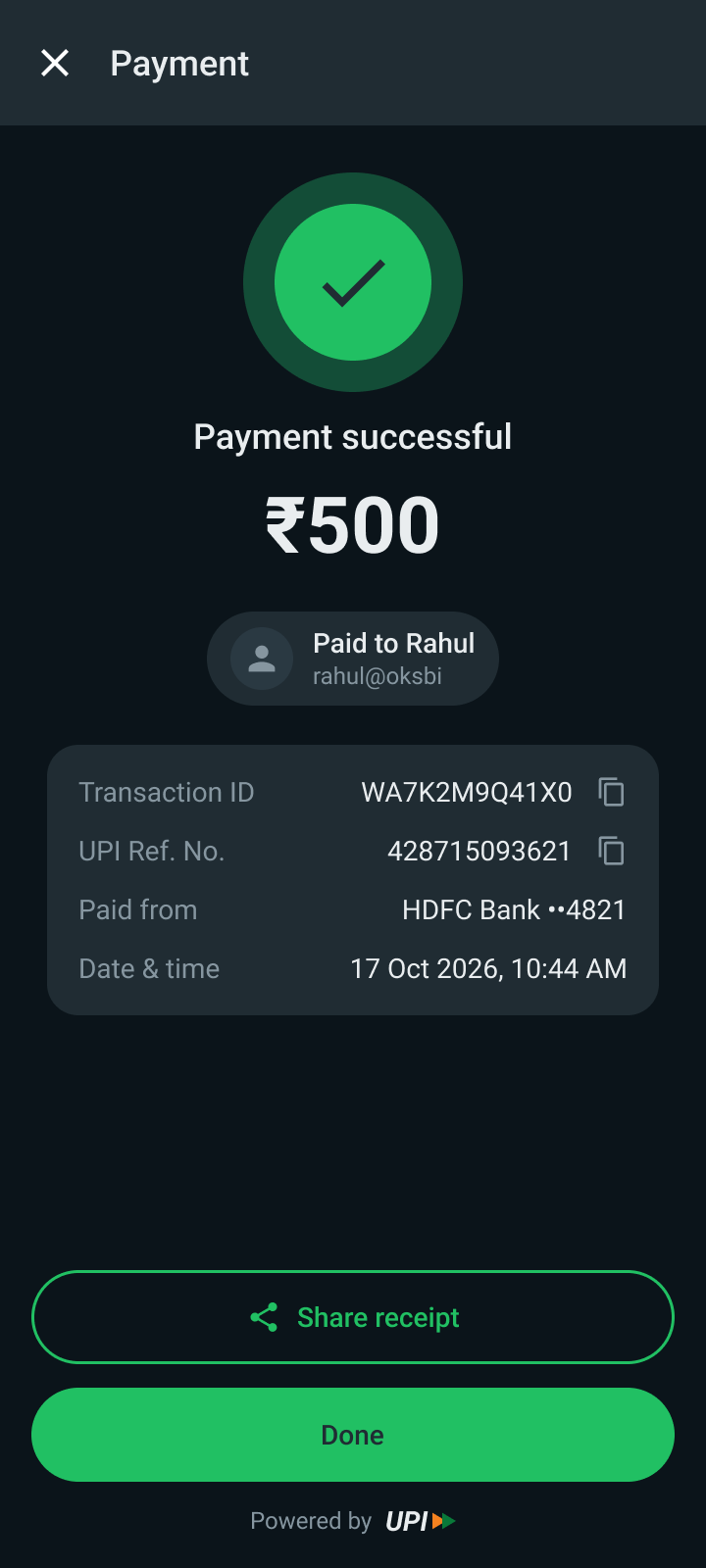
Payment successful confirmation with transaction details
A familiar UPI confirmation

The hero

Who is this project for?

The person who paid the bill

Every group has one. After the dinner, the farewell or the trip, one person pays up front and then becomes the group’s accountant: working out shares, posting UPI details, checking bank notifications and reminding people. I started by asking friends to walk me through the last time they collected money from a group.

The birthday dinner

One friend paid the restaurant bill, calculated everyone’s share and posted the amounts and UPI details in the group. Some paid at once, others forgot. The organiser kept checking payments and reminding people.

The college farewell

A UPI ID shared in the group, bank notifications checked one by one, payments matched against screenshots and a manual list of contributors, all while the chat filled up with confirmations.

The two-month wait

Money stayed outstanding for two months. Sending a request wasn’t the hard part. Asking again was. In the end, they stopped following up.

The second person in this story is the contributor: someone who already has a UPI app they like and no strong reason to change it.

The problem

What was stopping them?

Paying isn’t the hard part. Coordinating is.

WhatsApp is where groups already talk about money, yet most settle it somewhere else. Everyone has a UPI app, a QR code or a UPI ID, so a faster payment gives them no reason to switch. What breaks is everything around the payment: working out who owes what, collecting it, knowing who has paid and following up without nagging. That work lives in scattered messages and screenshots, and the person who paid ends up doing all of it.

Already solved

  • Sending money: QR codes, UPI IDs, banking apps
  • A preferred UPI app for each person
  • Payment habits that already work

Still done by hand

  • Calculating everyone’s share
  • Posting amounts and UPI details in the chat
  • Matching bank notifications to screenshots
  • Remembering who has paid
  • Following up without feeling awkward

I started with “How can I make WhatsApp UPI easier to use?” and ended up asking “What would actually make someone want to use it?”

The stakes

Why did it matter?

A feature nobody finds, trusts or returns to goes unused

For the people in the group, the cost is money stuck for weeks, awkward follow-ups and a chat full of payment noise. For WhatsApp UPI, it’s whether the feature earns a place in people’s habits at all. I framed success around four goals.

Discoverability

Can people find the feature at the moment they need it?

Usability

Can an organiser set up and track a group payment without screenshots?

Retention

Is there a reason to come back to WhatsApp for the next payment, not just the first?

Trust

Do people understand what WhatsApp handles, and what it doesn’t?

A note on evidence. My research was informal: conversations with a small number of friends. It shows a pattern worth investigating, not a statistic about every WhatsApp user.

The guide

Where do I come in?

One designer, one hypothesis, a lot of feedback

This is a personal concept project. I’m Kartik, a UX designer, and I worked on it alone: interviewing friends about their last group collection, mapping the flow, designing the screens in Figma and taking the idea to a senior product designer for critique. I’m not affiliated with WhatsApp or Meta, and the project uses no internal data.

Constraints I set for myself

  • Reuse what WhatsApp already has instead of duplicating it
  • The user decides when a payment starts. Nothing is triggered automatically
  • Respect the UPI app people already use
  • No promises the product couldn’t keep

How I used AI

  • A first AI-generated flow helped me see the whole journey, but it didn’t match my solution, so I kept it as a concept reference only
  • AI tools helped me build the screens in Figma
  • The research, the decisions and the critique were mine

The journey

What did I do?

Interviews, a first idea and a surprise

  1. Asked, didn’t pitchI asked friends to walk me through the last time they collected money from a group, instead of asking what features they wanted.
  2. Found the real problemThe pattern wasn’t payment. It was organising contributions, knowing who had paid and following up.
  3. First ideaType ₹500 in a chat and a small menu offers Pay or Request. In a group, request from everyone or pick people, and share a card with a QR code.
  4. Found Split ExpenseWhatsApp already had a Split Expense feature with a customisation flow. Part of my idea already existed.
  5. Pitched itI took the idea to a senior product designer, expecting feedback on the flow.

Two smaller signals stayed with me: some people would rather receive a QR code than go through a request flow, and one person was annoyed when a payment app opened its scanner automatically. Payment screens should help people do what they came to do, without extra steps.

The turning point

What changed the direction?

Two questions that broke my first idea

Why would someone type ₹500 expecting a payment menu to appear? And if every number could trigger it, wouldn’t it become intrusive?

Question 1: discoverability

Why would someone trust WhatsApp with payments?

Question 2: trust

I had been optimising for fewer steps. The critique showed I’d skipped the harder work: getting people to discover the feature, understand it and trust it. A clever shortcut isn’t useful if nobody knows it exists, and an automatic one is annoying when it appears in the wrong place.

I wasn’t designing a payment flow anymore. I was designing a behaviour.

The solution

What did I made?

From “I’ll split dinner” to “everyone has paid”

The main flow, told as one story: an organiser who paid for dinner, and a contributor who receives the request. Each step shows the real screens, what the user is thinking, and the decisions behind them.

Step 1

Discover it where the money talk happens

What they’re thinking

“Wait, I can do this right here?”

Design decisions
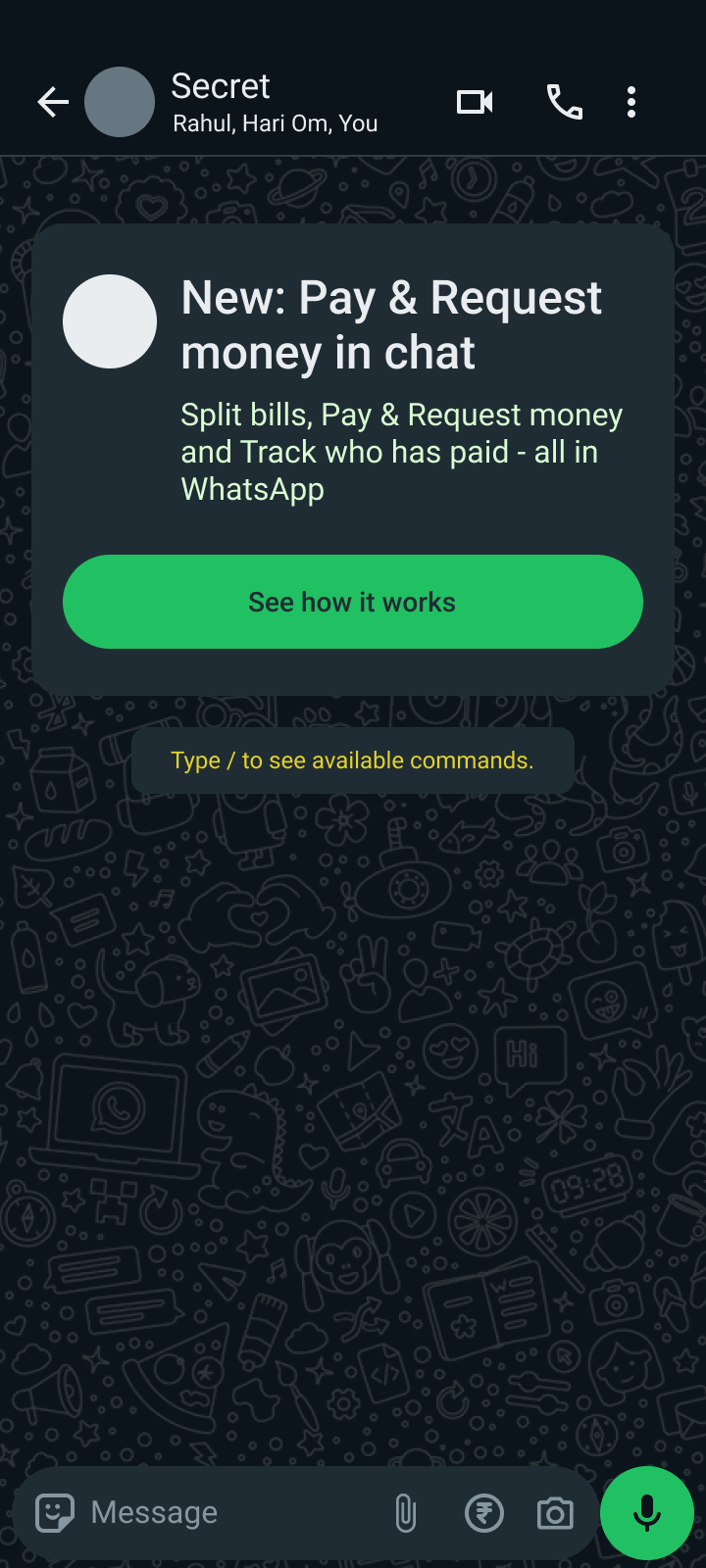
  • The prompt appears in the conversation, not buried in settings
  • One clear action: See how it works
  • A hint teaches the shortcut: Type / to see available commands
Chat with an introduction card: New, Pay and Request money in chat
Introduction card in the chat

Step 2

Choose the action, don’t guess it

What they’re thinking

“Do I want to pay, request or split?”

Design decisions

  • Typing / opens an explicit menu. Nothing is triggered by numbers
  • Each action has its own colour and icon, so the menu scans at a glance
  • The typed command sits on the right, so people learn the shortcut
Slash menu open with Pay, Request and Split Expenses
Type / to open the menu

Step 3

Pay a friend without leaving the chat

What they’re thinking

“I just want to send Rahul his ₹500.”

Design decisions
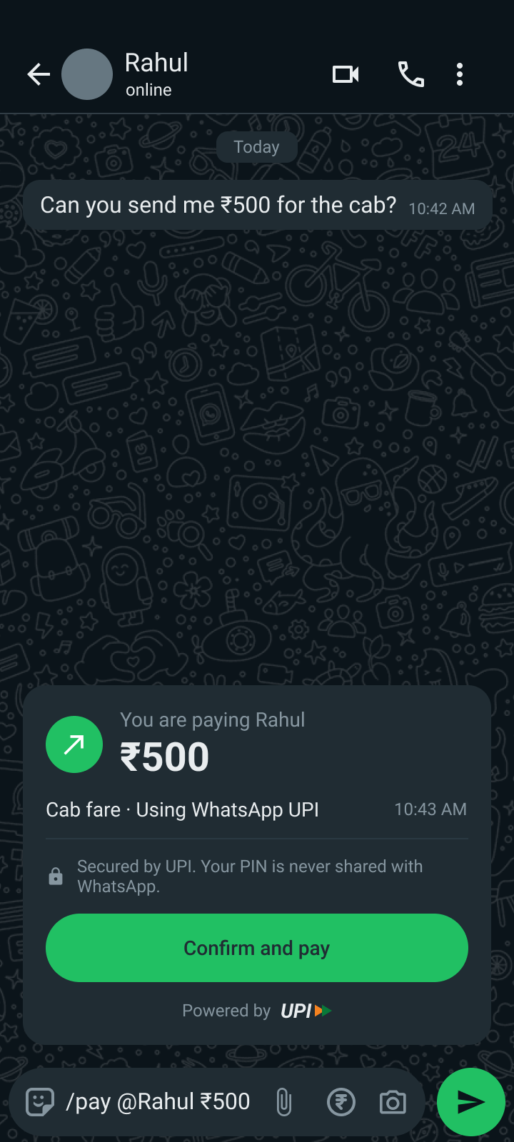
  • The confirmation card shows who, how much and which UPI path before anything moves
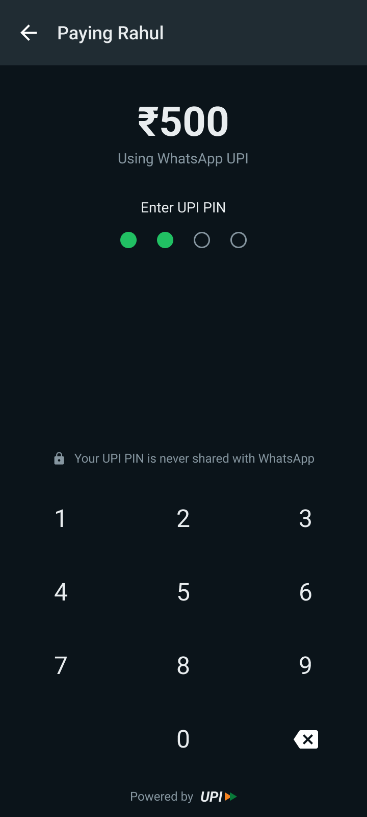
  • Trust cues sit where doubt happens: the card and the PIN screen
  • The success page follows familiar UPI apps: amount, payee, transaction ID, UPI reference, share receipt
Pay confirmation card in the chat
Confirm in the chat
UPI PIN entry screen with keypad
Enter UPI PIN
Payment successful screen
Payment confirmed

Step 4

Split a bill without a calculator

What they’re thinking

“I paid ₹3,000. I don’t want to do the maths or chase six people.”

Design decisions
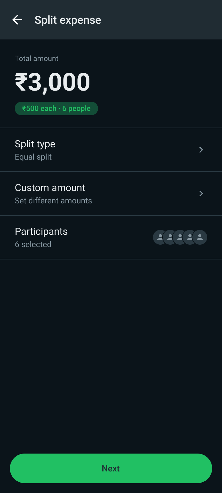
  • Reuses the existing Split Expense flow instead of a new editor
  • The per-person amount (₹500 each) is visible before sending
  • One card in the group shows progress and each person’s Paid or Pending status
  • Remind sits on the card, so following up doesn’t mean writing another message
Split expense screen with total, split type and participants
Split expense
Group card with progress and a Paid or Pending status for each person
The group card

Step 5

Keep track without screenshots

What they’re thinking

“Who still hasn’t paid, and do I really have to ask again?”

Design decisions
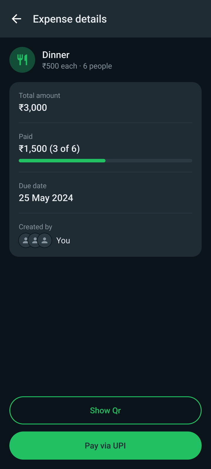
  • The details page shows what has been collected against the total
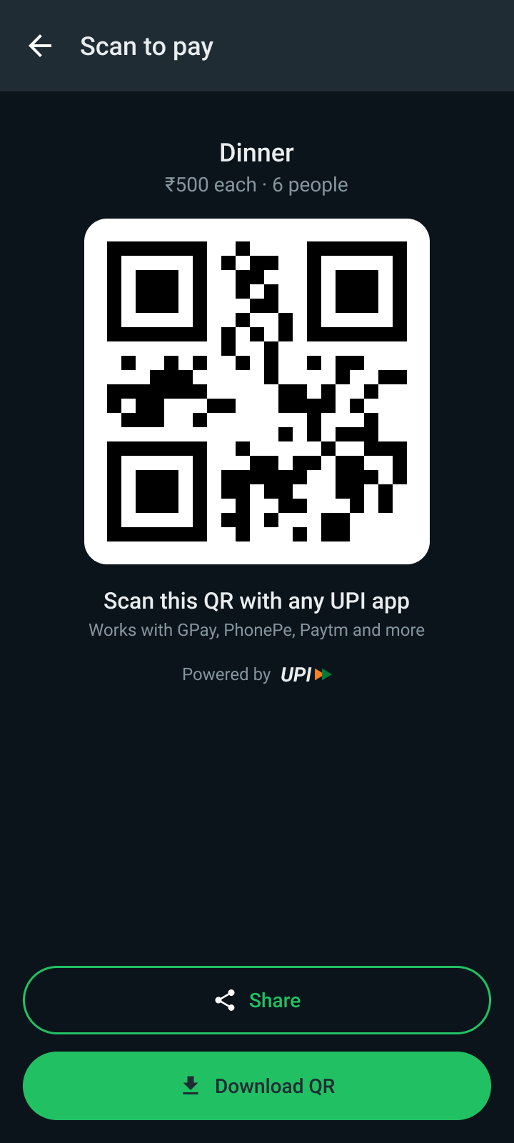
  • A QR code serves people who pay from another device or app
  • Pending stays pending until a payment is confirmed. A shared QR alone doesn’t prove payment
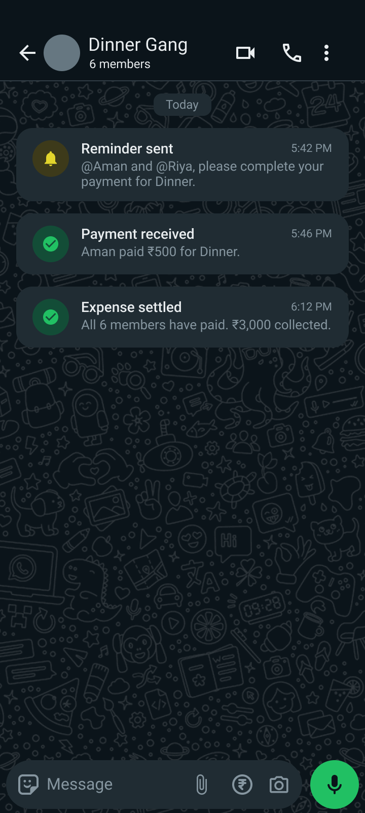
  • Reminders and updates arrive as short notices in the chat
Expense details with total, paid amount and progress
Expense details
QR code that works with any UPI app
QR for any UPI app
Chat showing a reminder, a payment received notice and an expense settled notice
Reminders and updates

Step 6

Pay your share with the app you already use

What they’re thinking

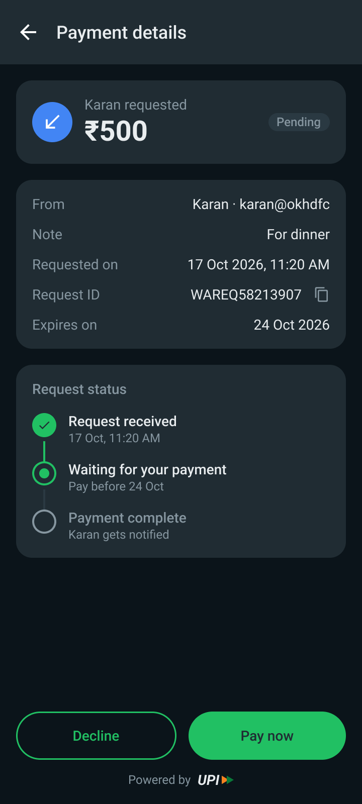
“Karan sent a request. I’ll pay, but I’m not switching apps for ₹500.”

Design decisions
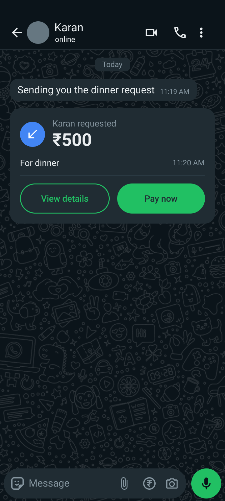
  • The request card shows who, how much and why, with Pay now and View details
  • The details page explains status, expiry and request ID, and lets people decline
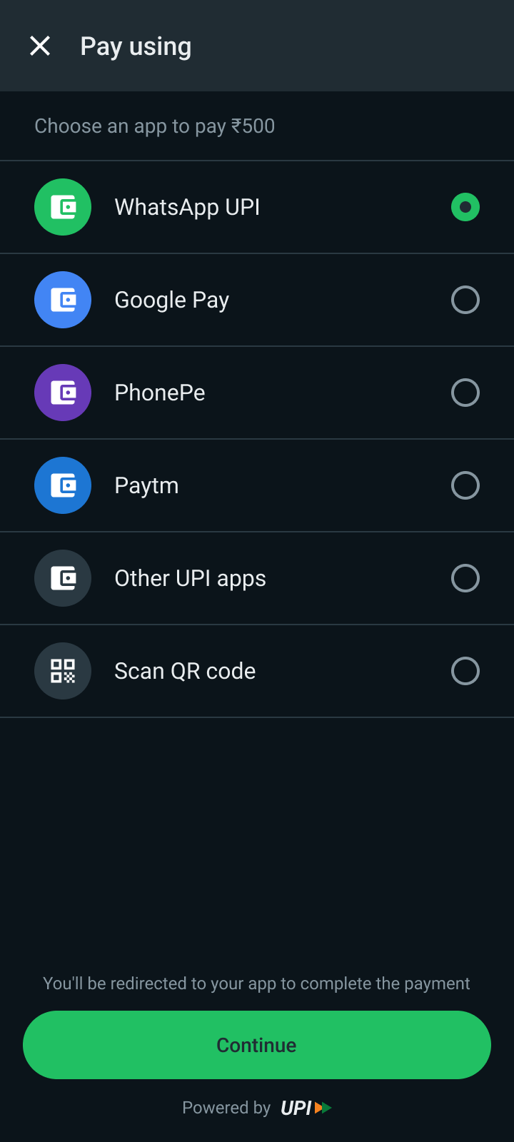
  • Pay using lets the contributor pick WhatsApp UPI, another UPI app or a QR code
Payment request card with Pay now and View details
The request card
Payment request details with a status timeline
Request details
Pay using screen listing WhatsApp UPI, other UPI apps and QR
Pay using

Four decisions that shaped it

These are the choices where I had real alternatives, and what I weighed before picking one.

Why a slash command replaced the amount-triggered menu

The moment
A senior product designer asked why anyone would type ₹500 expecting a payment menu to appear.
Before
Typing an amount opened a small Pay / Request menu. It relied on people discovering a hidden interaction, and would feel intrusive if every number triggered it.
Options and what I chose
Three options: an amount-triggered menu, AI that reads the chat and offers a payment, or an explicit “/” menu with an introduction card. I chose the third because it lets the user decide when a payment starts. The AI route would save a tap but add ambiguity and raise questions about how chat content is processed.
What I did next
An introduction card in the chat, a “/” menu with Pay, Request and Split Expenses, a colour-coded icon for each, and the typed command beside it as a shortcut.
Result so far
Not tested yet. Do people who see the card open the menu, and can they find it again without the card?

Why I reused Split Expense instead of building a new editor

The moment
Partway through, I found out WhatsApp already had a Split Expense feature with a customisation flow.
Before
My concept had its own way to create and edit a group request, so I would have duplicated something that already existed.
Options and what I chose
Build a new editor, or make the new interaction a better way into the existing one. I chose the second. It keeps the experience consistent and avoids two ways to do the same thing. Any engineering or API saving would still need to be validated.
What I did next
The “/” menu’s Split Expenses action leads into the split flow. I added one small hint, the per-person amount, and a group card that shows progress.
Result so far
Not tested yet. The open question is whether people notice the new entry point, not whether they can use the flow.

Why contributors can pay with the app they already use

The moment
People already have a preferred UPI app, and switching isn’t worth it for one dinner.
Before
A single path: everything went through WhatsApp UPI.
Options and what I chose
Push WhatsApp UPI for everyone, or separate two situations. When someone starts a payment, it uses WhatsApp UPI. When someone receives a request, they can choose another UPI app or a QR code. I chose the split. The trade-off: a QR doesn’t confirm payment, so WhatsApp can’t verify every external transaction without an integration or another confirmation step.
What I did next
A Pay using screen, a QR screen, and Paid and Pending statuses that don’t imply everything is tracked automatically.
Result so far
Not tested yet. How external payments get confirmed is an open question for engineering.

Earning trust without over-claiming

The moment
The second question from the critique: why would someone trust WhatsApp with payments?
Before
I had focused on removing steps and hadn’t explained why anyone should adopt the experience.
Options and what I chose
Reassure loudly, or show what is actually happening. I chose to show it: an explicit action before any payment, UPI branding on payment screens, a PIN screen that says the PIN isn’t shared with WhatsApp, and a confirmation with a transaction ID and UPI reference.
What I did next
Placed those cues where doubt appears: the confirmation card, the PIN screen and the success page.
Result so far
Trust is still a requirement, not a solved problem. The wording on these screens is placeholder copy that would need checking against what a real implementation can promise.

What I dropped

Amount-triggered menu

Typing ₹500 opened Pay and Request. Hidden, and intrusive if every number triggers it. Replaced by the “/” menu.

AI-inferred payment intent

Reading the chat to offer a payment would save a tap but add ambiguity. I kept the user in control of when a payment starts.

A new expense editor

Replaced by reusing Split Expense, with the new interaction as a more convenient way in.

The resolution

What improved?

What changes on paper, and what I can’t claim yet

This is a concept, so I have no usage numbers and I won’t invent any. What I can show is how the experience changes for the organiser, and how I would find out whether it works.

Today

  • Work out shares by hand
  • Post amounts and UPI details in the chat
  • Match bank notifications to screenshots
  • Remember who has paid
  • Chase people one message at a time

With this concept

  • Split Expenses calculates the shares
  • One request card carries the amount, the payment options and a QR
  • Paid and Pending are visible on the card
  • Remind sits on the card
  • Contributors pay with the app they already use

How I’d know it worked

Discovery

Share of people who open the “/” menu after seeing the introduction card.

Completion

Share of group requests that are fully settled, and how long that takes.

Follow-ups

How many manual reminders an organiser still has to send.

Trust

Where people drop off between the confirmation card and the PIN screen.

The reflection

What did you learn?

My first idea wasn’t the right solution

Research moved me off my assumption

I assumed fewer steps would drive adoption. The conversations pointed to the work around the payment: organising, tracking and following up.

Check what already exists

Finding Split Expense made me ask whether I needed to build anything new, or just connect existing pieces so people can discover them.

Critique finds what you skip

Two questions from a senior designer exposed the gaps I hadn’t looked at: discoverability and trust.

Say what users said, not what I assumed

I learned to separate what people told me from what I assumed, and a business goal from a user problem.

What I’d do differently

  • Interview more people, beyond friends
  • Usability-test the “/” menu with people who have never seen it
  • Ask an engineer how external payments could be confirmed
  • Test the trust wording with real users

Where it could go next

  • An expenses view across groups, so an organiser can see everything outstanding in one place
  • Reminders in a neutral tone, because asking again felt awkward
  • Command labels in more languages, so the shortcut works for more people
  • A clearer way to confirm payments made outside WhatsApp

Making group payments easier to coordinate, not just easier to send.