01 / 04
Make the card answer the question, not the detail page
Problem
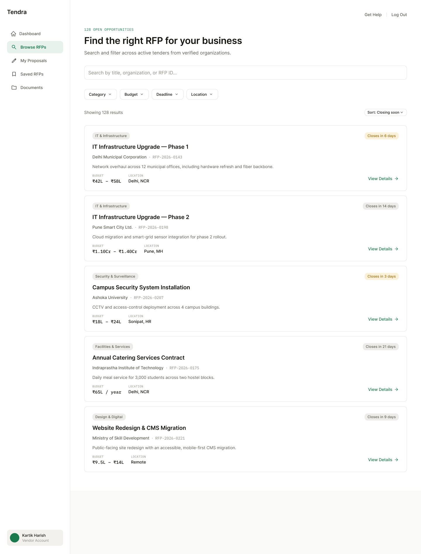
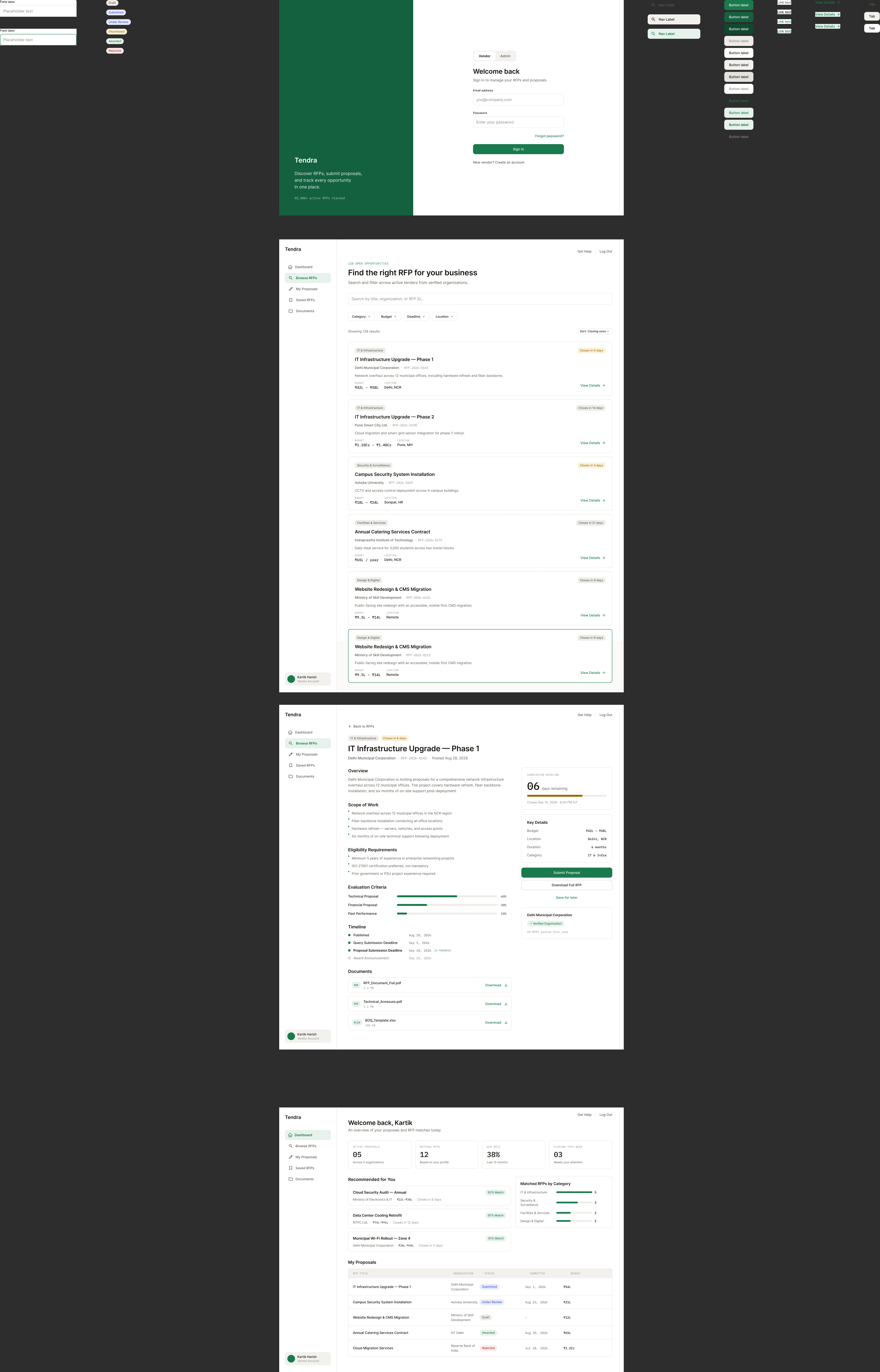
"IT Infrastructure Upgrade Phase 1" and "IT Infrastructure Upgrade Phase 2" sit back to back in a list of 128. A title-and-category card, which is what the first AI-generated pass produced, makes them look like duplicates.
Discovered
The information that actually tells them apart (organization, budget scale, deadline, RFP ID) already exists. Convention just hides it behind a click, on the assumption that cards should stay minimal. That assumption is exactly what breaks this brief.
Decision
Promote organization, RFP ID, budget range, and deadline into the card itself, in a consistent scannable position.
Result
Delhi Municipal Corporation, ₹42L to ₹58L, closing in 6 days. Pune Smart City Ltd., ₹1.1Cr to ₹1.4Cr, closing in 14 days. Obviously different opportunities, no need to open either one.